
What are Heat Maps?
Heat maps are the maps which are the geographical representations of datas where values are represented as colours. They provide an easy way to visualise the density of the data points in 2D space, often showing patterns and correlations that would be difficult to see otherwise. They are widely used in the fields such as marketing, data analysis and finance.
Using Heat Map on Google Maps
A heat map on the Google Maps is a type of geographical representation overlay that displays datas as a range of colours, where the colour intensity represents the value of the data points in that area. Heats maps in our conventional google map are generally used to represent the data such as population density, crime rates of a particular area, temperature or traffic intensity. They help us understanding a large amount of datas in quick and easy way. To create the heat map on google map, we can use the google map API to upload our data and generating the data visualisation.
Heat Maps in Disaster Recovery
Heat Maps can be used very effectively during the time of a disaster recovery. They can be used to visualise and analyse data related to the impacted area and how extent is a disaster. This data can include affected areas, population density, infrastructure damage, and resource distribution. By using heat maps, disaster management team can easily spot out the area where they need to focus or prioritise more and allocate more resources, unlikely helping the less impacted area.
In short we can point out the advantages of Heat Maps in disaster Recovery as folllows:
- Visual representation of impacted areas.
- Spot out the high-risk zones quickly.
- Helps in faster decision making.
- Improved coordination and collaboration between different DR communities.
- Improved resource allocation.
How we can use Heat Maps in RescueHands?
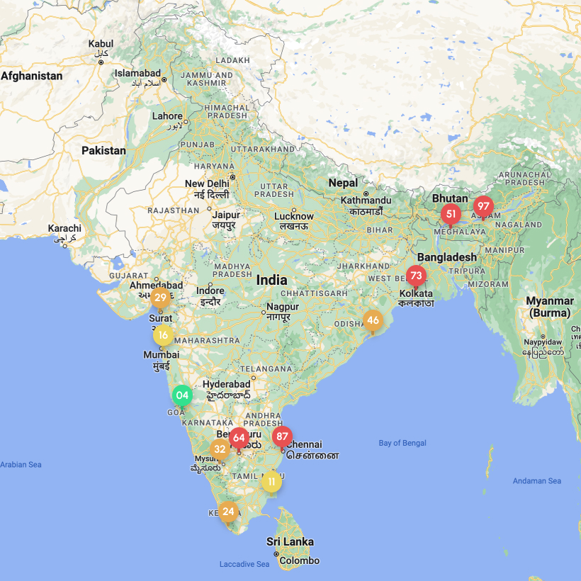
In RescueHands application, heat map is used to identify the locations of raised issue tickets. It will show the number of tickets raised from each area. We can mark the location of the issue while creating the issue ticket. Further all these issue locations will be shown in the map which help us to find those areas where we need to prioritise the recovery actions.
When the map is zoomed out, it will show the total number tickets associated to a particar area in circle and mentioned the number of tickets from those area inside the circle as below:
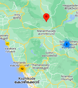
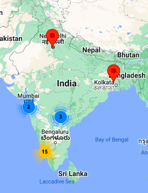
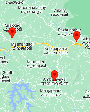
As we zoom in , we can see that, the circle is splitted in further more circle spots mentioning the tickets. Further zooming, we notice the circle spot break down to an exact location of a single ticket raised as below:
Co-Founder , Ceegees Software Solutions Pvt Ltd.
Problem Solver, Engineer